StepIndicator
Description
The Step Indicator control is used to show what step a user is on in a multi-step action.
Discussion
The image below shows a Step Indicator control configured to show four steps, labeled One, Two, Three and Four.

When you add a Step Indicator control you can specify as many steps as you want and you can define the labels for each step. You can also control the color of the completed steps (blue in the above example) and the un-completed steps (gray in the above example).
The Step Indicator control is a Data Control. This means that you can set its value using the {dialog.object}.setValue() method and you can read its value using the {dialog.object}.getValue() method.
For example, to set the above control so that it shows you are at the beginning of the sequence (on the first step) you would use:
{dialog.object}.setValue('name of control',0);To set the control's value so that it shows you are on step Three (i.e. as shown in the above image) you would use:
{dialog.object}.setValue('name of control',2)How to Add a Step Indicator Control
A Step Indicator control can be added as follows:
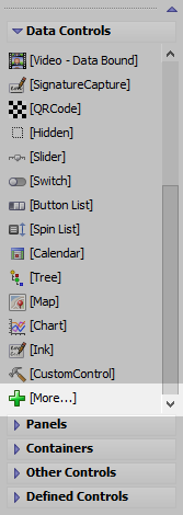
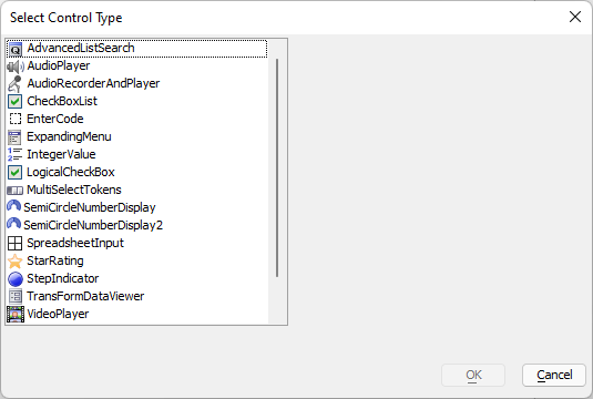
Select the [More...] entry in the UX toolbox in the Data Controls section.

In the Select Control Type, choose StepIndicator.

To configure a Step Indicator control, click the smart field for the control's Control Properties property.

In the image below, the 'Dot' size has been increased, the 'Show step indicators as circles' property has been turned off and the 'Dot size' has been set to '40px'. A small border radius of 2px has been set so that the 'dot' (squares in this case) have slightly rounded edges.

Inserting an Add-in Control
Add-in Controls are inserted using the More... option in the Data Controls section of the UX Builder.
Select the control you would like to add and click OK.
In addition to the controls that ship with Alpha Anywhere, you can also create your own add-in controls. See How to Create Add-in Controls to learn more.
Videos
Step Indicator Control - Repopulating and setting Direction
The Step Indicator control is a convenient way for showing progress through a task. In this video, we show how the list of steps can be dynamically changed at run-time and how the direction of the steps can be changed to support right-to-left languages such as Hebrew and Arabic.
See Also