SemiCircularNumberDisplay Control
Description
The SemiCircularNumberDisplay control can be used to display numeric data as a semi-circular chart.
Overview
The SemiCircularNumberDisplay control allows you to display a numeric value on a semi-circular chart. It is ideal for using in 'dashboard' type applications. You can configure the color of the control so that it changes depending on the value. For example if a numeric value is in the 'safe' zone, you might set the color to green, and if the value was in the 'danger' zone, you might set the control color to red.

Like other Data controls, the value of the SemiCircularNumberDisplay can be set and read using the {dialog.object}.setValue() and {dialog.object}.getValue() methods. For example:
var increment = function (incrementBy) {
    var value = parseInt({dialog.object}.getValue('num1'),10);
    var newValue = Math.max(0,Math.min(value + incrementBy, 100));
    {dialog.object}.setValue('num1', newValue);
}
Adding a SemiCircularNumberDisplay Control
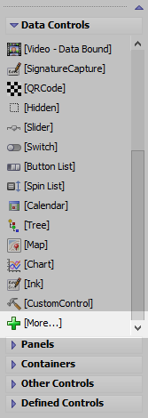
Open the Data Controls toolbox and select
 More....
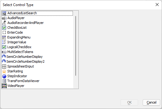
In the Select Control Type, select SemiCircularNumberDisplay from the list of controls and click OK.

Configure the Name and Label for the control. You can optionally add multiple SemiCircularNumberDisplay controls by selecting Create multiple new controls at once. Click OK when you are satisfied with the settings.

If not set, set the Default value for the control.

If not set, set the Height. Alpha Anywhere will automatically populate the Height with a value of "3in" when the component is previewed if the Height is not set.

Click the
 button for the SemiCircularNumberDisplay's Control Properties to configure the control.
When you are satisfied with your control, click OK to save the changes.

Preview your control in Live or Working Preview.

Configuring Control Properties
Properties of note in the builder include:
- Property
- Description
- Color type
Choices are 'Static', 'Dynamic' and 'Javascript'. 'Static' - a single color is used to display all values. 'Dynamic' - different colors are used for different ranges of numbers (see below for more information), 'Javascript' - you can specify Javascript code to dynamically compute the color.
- Animate
This option is only available if the Color type is set to Static. Specify if the chart is animated when it's value is set.
- Other properties
Allows you to set other properties of the chart not exposed in the builder. The control is based on the RGraph library (see http://RGraph.net for more information) and there are many more properties to control the appearance of the chart than are exposed in this dialog.
Defining Dynamic Colors
When you set the Color type to Dynamic you can define a series of ranges and the corresponding color for each range. Click the smart field for the Values ranges property (shown when the Color type is Dynamic) to open the builder (as shown in the image below)
The builder allows you to define multiple ranges and for each range, you can specify a color.

See SemiCircularNumberDisplay Control Properties for more information about configuring the control.
Additional SemiCircularNumberDisplay Control Topics
- Name
- Description
- Set the Min and Max Values at Run-time for a SemiCircularNumberDisplay Control
The minimum and maximum value of the SemiCircularNumberDisplay Control can be dynamically set at run-time.
Inserting an Add-in Control
Add-in Controls are inserted using the More... option in the Data Controls section of the UX Builder.
Select the control you would like to add and click OK.
In addition to the controls that ship with Alpha Anywhere, you can also create your own add-in controls. See How to Create Add-in Controls to learn more.
Videos
To learn more about the SemiCircularNumberDisplay control, watch the videos below:
SemiCircularNumberDisplay Control
The semi-circular number display control displays the value of a number on a semi-circular chart. It is ideal for dashboard type applications.
This video shows how you can add a semi-circular number display control to a UX component and how you can configure the component.
See Also