Detail View
Description
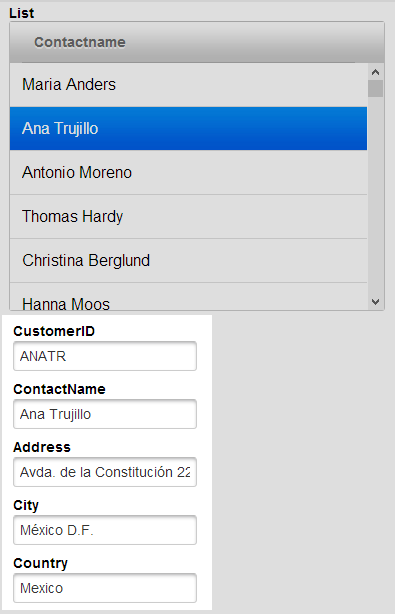
A Detail View allows you to take the row of a given field displayed in a list control and show information from other fields related to that row. For example, say you had a list of customers displayed a simple list control. Every time you highlighted a given customer in that list, the detail view would display that customers specific data (address, phone number, country, etc..). Here are the Detail View Property Sections displayed in the List Builder:
- Name
- Description
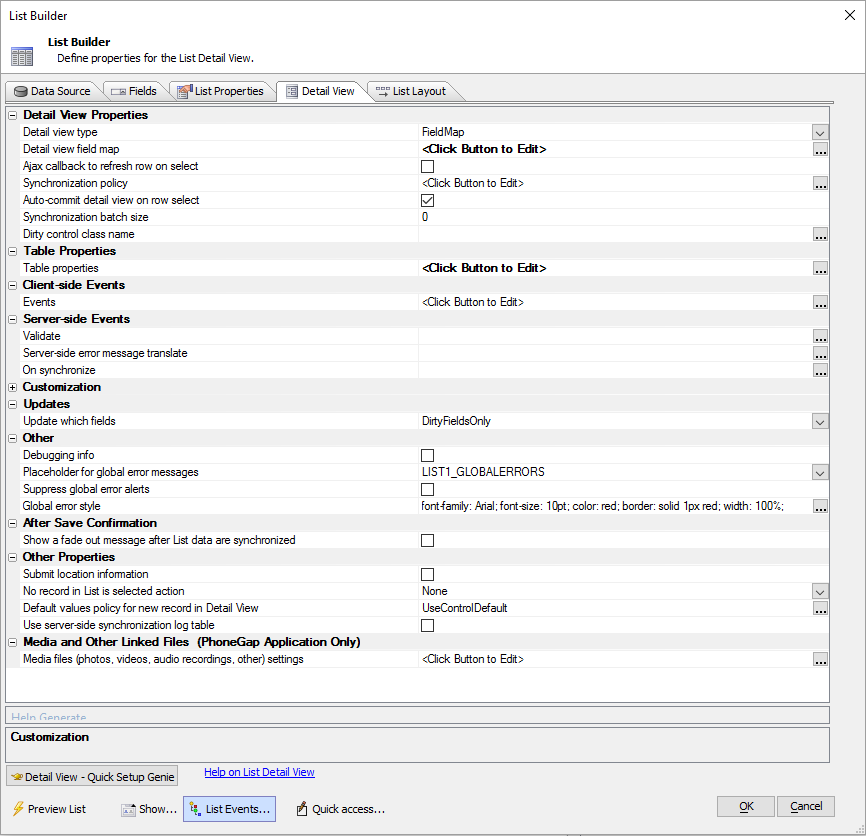
- Detail View Properties
Settings to configure a List control's Detail View, including control mapping and synchronization behavior.
- Table Properties
Properties available for a table.
- Detail View Client-side Events
These are the Client-side events used with the UX component's List control's Detail View.
- Server-side Events
The List control Detail View's server-side events can be used to add additional logic for during synchronization and validation.
- Customization
When certain events are triggered, Alpha Anywhere provides a number of default warning and error messages to go along with the event. For example, if you have a list control with a detail view that has an 'Reset' button that you click after making an edit, you will get a warning message. The Customization section of the Detail View is where you can alter the CSS and text of these various messages to your liking.
- Updates
Here
- Media and Other Linked Files
Define settings for uploading and downloading media files (pictures, videos, recordings and other linked files) for a Cordova application.
- After Save Confirmation
Here
- Other Properties
Configure submission location info, what to do if there are no records in the List, the default value policy for new records, timestamp data, and more for a List's Detail View.
- Other
Here
Creating a Detail View in the List Builder is a fairly simple task. For a video walkthrough using static data or SQL data, watch this video.
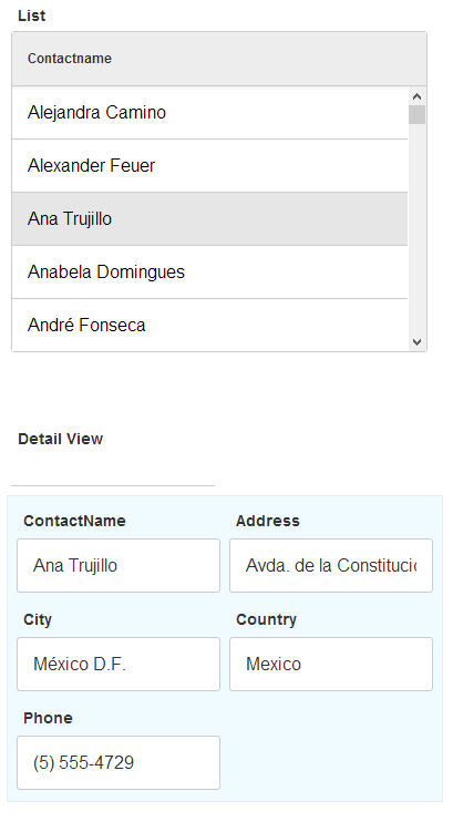
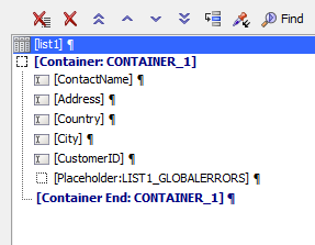
Below is simple list control that has a detail view placed inside a container control; in order to achieve the background and border styling. Each box displaying information in the detail view is represented by a control.
Creating a Simple Detail View.
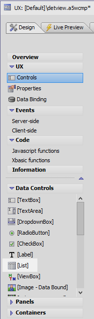
In the UX Builder open the Controls page and add a List Control to the component.
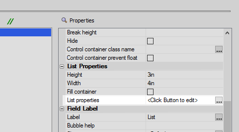
Click the List properties property, in the List Properties section of the control properties list, to open the List Builder.
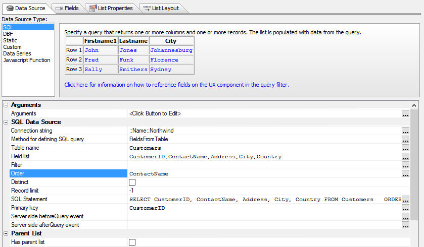
Define the list control's data source in the data source tab. This example uses a SQL Data Source type and the Northwind database.
In the List Layout tab, use the blue > arrow to move one field from 'Available Fields' to 'Columns in List'.
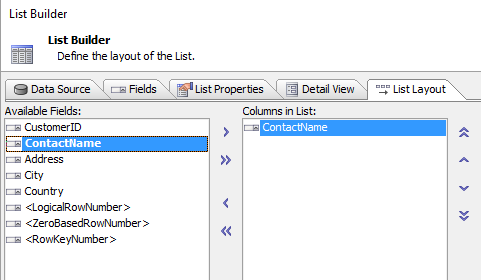 The Field that will appear in the list.
In the List Properties tab click the 'Has Detail View' property.
 Has Detail View
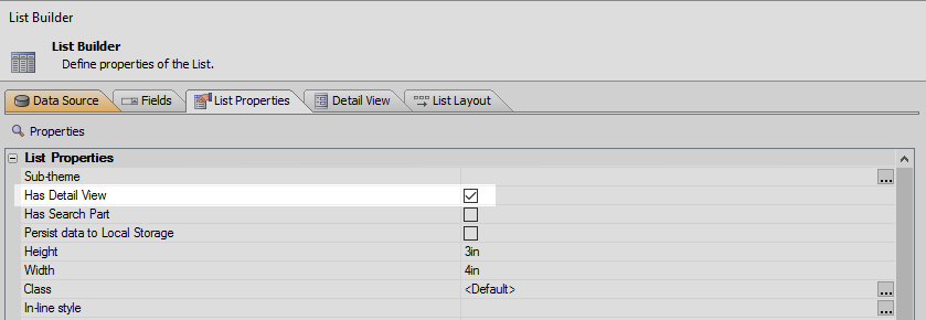
Go to the Detail View tab on the Grid Builder.
The Detail View PropertiesClick the Detail View - Quick Setup Genie button in the lower right-hand corner of the Detail View tab.
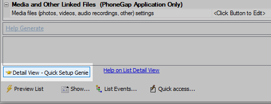 Detail View quick setup genie button
Check "Create controls on the UX to display the List Detail View". Click OK.
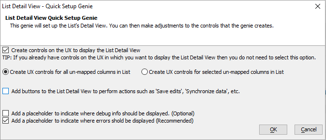 Quick Setup Genie
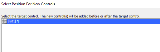
Select the list that you want to link to the detail view. Also choose where you want the detail view positioned, Before or After the list, and click OK.
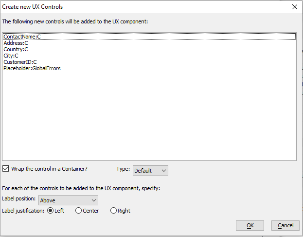
The "Create new UX Controls" dialog will open. This will display all of the fields that the detail view will contain. Click OK
The new controls for the Detail View should now appear in the UX component.
Run in the component Live Preview. Click through the list, the detail view should update.