Alpha Style SVG Icons
Description
Alpha Anywhere now comes with a set of pre-defined SVG icons that can be used with any style. These SVG icons are the same icons that the new Alpha stylesheet uses.
When you are using a stylesheet other than the Alpha stylesheet, when you open the SVG Icon picker you will see that the system SVG icons are shown in a category called System SVG Icons. In addition, the Class dropdown will have three special auto-generated classes that can be applied to the SVG icons. These are:
icon
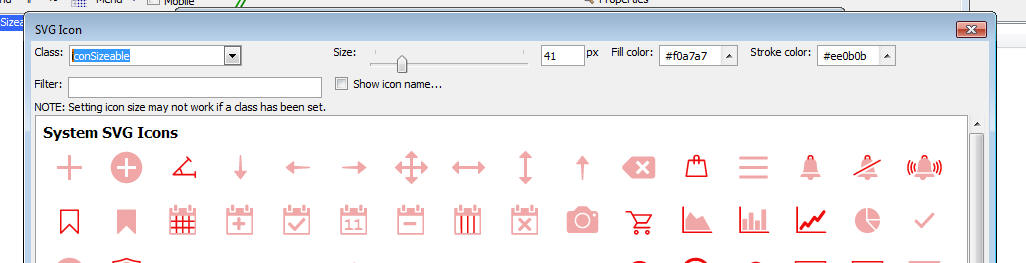
iconSizeable
iconDisabled
The definition of these classes are shown below.
If you do not select any class, some of the images will not render properly because the stroke color of the SVG icon is not defined.
You must select either icon or iconSizeable for the icons to render correctly.
You will notice that the icon class defines a explicit size for the icon (26 x 26 px). Therefore changing the size using the slider on the dialog will have no effect.
If you would like to be able to size the icon, you should select the iconSizeable class.
You can also define your own classes in the component's Local CSS, or Linked CSS to apply to the SVG icon.
.icon {
    vertical-align: middle;
    width: 26px;
    height: 26px;
    fill: #333;
    stroke: #333;
}
.iconSizeable {
    vertical-align: middle;
    width: auto;
    height: auto;
    fill: #333;
    stroke: #333;
}
.iconDisabled {
    opacity: .25;
}
Videos
SVG Icons
SVG Icons have many benefits over bitmap images and font icons. In this video we introduce you to SVG icons and show how they can be used in your components. Topics that we will cover include adding and styling SVG Icons, importing SVG Icons into a component, creating and linking external SVG Icons files into components, and using SVG Icons in a menu List.