ControlBar Actions
Description
Performs an action on a ControlBar, such as setting the active Layout or refreshing the ControlBar.
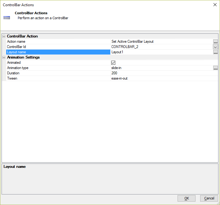
ControlBar Action Properties
- Action name
Specify the ControlBar Action that you want to execute. An action can be one of the following:
- ControlBar Action
- Description
- Refresh ControlBar
Refresh a ControlBar.
- Set Active ControlBar Layout
If a ControlBar defines multiple Layouts, select the Active Layout.
- Update ControlBar Data
If a ControlBar has a 'data' object, update one or more properties in the ControlBar's 'data' object and then refresh the ControlBar.
- Show Disclosure
Opens a Disclosure defined in the ControlBar.
- Hide Disclosure
Hides the currently open Disclosure.
- Play Action
Executes the JavaScript defined in a ControlBar Action.
- Display a message
Display a message that has been imported using the 'Messaging Functions'. 'Messaging Functions' can be imported into the ControlBar using the hyperlink on the 'Home' tab in the ControlBar builder.
- ControlBar Id
Specify the ControlBar you want to perform an action on.
- Messaging definition
Opens the Control Bar Message dialog for configuring the type of message to display. A Basic, Confirmation, or Wait message can be shown.
- Disclosure name
Specify the name of the Disclosure you want to show
- Show disclosure settings
Opens the Disclosure Genie for configuring how a disclosure should be shown.
- Action name
Specify tne name of the ControlBar action you want to execute
- Layout name
The ControlBar layout to display.
- Data variables to update
Enter a cr-lf delimited list of the ControlBar data items you want to update.
- Data variable values
The 'data' variable to update.
- Fire onChange event
Specify if the onChange event should fire.
- Delay render
Whether or not to delay the refresh of the ControlBar. This is useful if other code may also refresh the ControlBar and it is desirable to only have one refresh occur.
Animation Settings Properties
- Animated
Specify if the ControlBar action should be animated.
- Animation type
The type of animation to use. There are three basic types of animations: slide, swap, and fade. The "slide" an "swap" types are suffixed with an edge (left, right, top, bottom) or with relative values based on the ControlBar's edge (in, out, before, after.) The available animation types are listed below:
- slide-left
- slide-right
- slide-top
- slide-bottom
- slide-in
- slide-out
- slide-before
- slide-after
- swap-left
- swap-right
- swap-top
- swap-bottom
- swap-in
- swap-out
- swap-before
- swap-after
- fade
- Duration
Specify the animation duration in milliseconds
- Tween
Defines how intermediate states of the animation transition are calculated.
Animation Properties
- Animate
Specify if the disclosure should be animated when it is hidden. If checked, the same animation that was used to show the disclosure is used.
Disclosure Genie
The Disclosure Genie is used to define the Show Disclosure settings for displaying a Disclosure for the ControlBar.
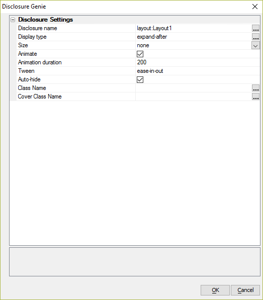
Disclosure Settings Properties
- Disclosure name
Specify the name of the disclosure to show. You can also show a named Layout as a disclosure.
- Display type
Specify where the disclosure should be shown. Can be one of the following types:
- expand-before
- expand-after
- expand-element
- expand-element-cover
- extend
- extend-element
- extend-element-cover
- cover
- outside-before
- outside-after
- screen-left
- screen-right
- screen-top
- screen-bottom
- explicit
- Size
Specify the disclosure size. Enter an explicit size using CSS syntax or specify 'none' (to use a default size) or 'fill' (to fill the available space for the disclosure).
- Animate
Specify if the disclosure should be shown with animation.
- Animation duration
(Optional) Specify the animation duration in milliseconds. If you leave this blank, the default duration is used.
- Tween
(Optional) Specify the animation tween setting. If you leave this blank, the default tween is used.
- Auto-hide
Specify if the disclosure should be closed automatically when the user clicks/taps off the disclosure.
- Class Name
Optional override to the class name to place on the disclosure element.
- Cover Class Name
Optional override to the class name to place on the element that covers the screen when the disclosure is shown.
Clipping Rectangle Properties
If explicit is chosen for the Display Type, you must define an explicit clipping rectangle. The clipping rectangle is an object with the following properties: left, right, top, and bottom. These properties define the relative distance to the edge of the screen in pixels.
In addition to defining left, right, top, and bottom, you must also specify the edge within the clipping rectangle from which the disclosure will be shown and the fill.
- Method for specifying
You can specify the size of the clipping rectangle now, or you can dynamically compute it at run-time. Choices include SpecifyNow, Javascript.
- Javascript
Specify the Javascript to compute the clipping rectangle. Your javascript must return an object with the following properties: edge, fill, left, right, top, and bottom. See examples below.
- Left
Distance from the left edge of the screen in pixels.
- Right
Distance from the right edge of the screen in pixels.
- Top
Distance from the top edge of the screen in pixels.
- Bottom
Distance from the bottom edge of the screen in pixels.
- Edge
The edge from which the disclosure is shown from within the clipping rectangle. Choices include top, bottom, left, right.
- Fill
The fill . Choices include width, height, both.
Specifying the Clipping Rectangle with JavaScript - Example 1
The following example specifies a clipping rectangle spaced 100 pixels from each edge of the screen:
return {left: 100, top: 100, bottom: 100, right : 100, edge: 'top', fill: 'width'};Specifying the Clipping Rectangle with JavaScript - Example 2
The following example demonstrates how to dynamically compute the width of the clipping rectangle based on the screen size of the device. The width of the clipping rectangle has a maximum of 500 pixels:
var s = {dialog.object}.getSize();
	var w = s.width
	var padding = 10;
	var dialogWidth = (w - (padding*2));
	var maxDialogWidth = 500;
	if(dialogWidth > maxDialogWidth) {
		var paddingTotal = (s.width - maxDialogWidth);
		padding = paddingTotal/2;
	}
	return {left: padding, top: 100, bottom: 10, right : padding, edge: 'top', fill: 'width'};
Control Bar Message Dialog
The Control Bar Message dialog is used to configure a popup message shown for the selected ControlBar. In order to display messages for a ControlBar, you must import the 'Messaging Functions' in the ControlBar. 'Messaging Functions' can be imported using the link on the 'Home' tab in the ControlBar builder.
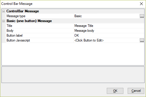
ControlBar Message Properties
- Message type
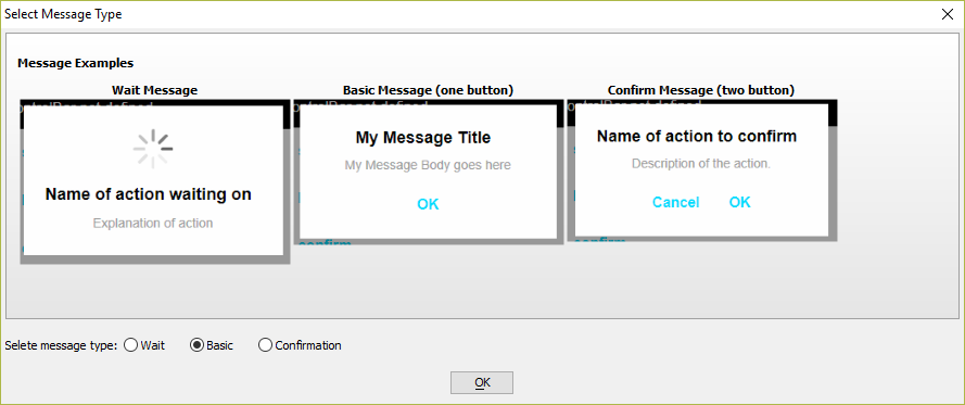
Specify the message type. Message can be one of the following:
- Basic
- Wait
- Confirmation
Wait Message Properties
- Title
The wait message title.
- Body
The message to display.
- Auto close after specified interval
Specify if the wait message should be automatically closed after a specified interval. (Useful if the Ajax callback that would normally close the wait message fails)
- Interval
The length of time to wait, in milliseconds, before the wait message is automatically closed.
Basic (one button) Message Properties
- Title
The title for the popup message.
- Body
The message to display.
- Button label
Specify the label for the button
- Button Javascript
Javascript to execute after the button is clicked.
Confirm (two button) Message Properties
- Title
The confirmation message title.
- Body
The message to display in the confirmation message.
- OK button label
The text to display in the OK button.
- Cancel button label
The text to display in the Cancel button.
- OK button Javascript
Javascript to execute after the OK button is clicked.
- Cancel button Javascript
Javascript to execute after the Cancel button is clicked.