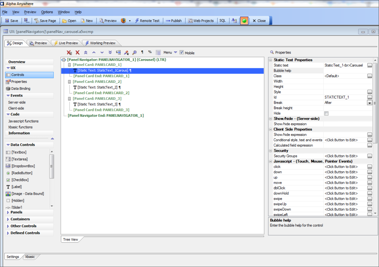
One of the fundamental building blocks to consider as you create a mobile website or application with the next version of Alpha, is how a user will navigate between Panel Cards. Panel Cards are the space on which you group your fields, buttons and controls. In order to move between the Panels, you will employ a Panel Navigator.
 Using these controls, you'll be able to create a mobile website or mobile application with rich gesture controls, in which the user can slide between panels left to right, right to left, top to bottom or bottom to top. And, when changing the orientation of the mobile device from portrait to landscape or vice-versa, the panels are automatically re-arranged so that they fit optimally in the space available. In today's mobile+ world, with screen sizes from 4 inches to 4 feet, the ability to create a mobile website or application with an optimal user experience on every device is crucial. With the upcoming version of our platform, it's easy.
[Learn more about building mobile apps with Alpha Five v11]
The Panel Navigator is used to select the Panel that is active. Our builders provide you with several different methods for selecting the active panel—including carousel, programmatic, tab buttons, tab band, list and orientation change—all of which are designed to provide a smooth and intuitive end-user experience.


Comment