
A hot area in web site design the last couple of years has been “Responsive Web Design”. This refers to a web design approach aimed at crafting sites that automatically provide an optimal viewing experience, with a minimum of panning and scrolling, across a wide range of devices, such as smartphones, tablets, and desktops. The poster child for this started out as the Boston Globe’s web site, which continues to be used as an example.
What I haven’t seen discussed as much is how we should design responsive business apps implemented in HTML, CSS, and JavaScript meant for data entry, analysis, and control, as opposed to web sites meant for reading. Custom mobile apps are in high demand for businesses. Leveraging web technologies to develop mobile apps can help mobile enterprises without requiring application developers specialized in native mobile app languages. Alpha Anywhere takes this advantage an extra step, letting you develop a mobile application once and deploy it to any platform - web, mobile, or desktop.
This blog post is designed to give you a good idea as to how Alpha Anywhere tackles this challenge.
RESPONSIVE APP DESIGN FOR DATA-DRIVEN APPS
A video by Dan Bricklin, CTO Alpha Software.
[ Watch on YouTube ]The simple demo web app in the video was built using the Alpha Anywhere HTML5 development system. To see a quick overview of Alpha Anywhere and the new Responsive Layout Genie feature used to make it responsive, watch How the Responsive App Design Demo Was Built With Alpha Anywhere on YouTube.For more information about Alpha Anywhere, go to www.AlphaSoftware.com. Disclaimer: Dan Bricklin is CTO of Alpha Software Corporation.
"Responsive App Design" narration script
Hi! I'm Dan Bricklin. Back in the late 1970's, I had an interesting design problem. My friend Bob and I were trying to build a program that would let you create and update computer versions of what was usually done by hand: Spreadsheets of numbers and words, with calculations and formatting.This is a paper spreadsheet used by my father in the family printing business and here are some tables printed in an old book with school data. That's how it was usually done before our VisiCalc program and what I was trying to automate with computerized recalculation.
A major challenge was figuring out how to fit everything needed onto the limited space of the screen. Some computers had a screen 80 characters wide, but my first target, the Apple II, had only 40. We ended up using a combination of scrolling areas, synchronized locked panes, status areas, a formula bar, and more. It worked quite well.
Later electronic spreadsheet programs, like Lotus 1-2-3, kept the same general layout.
Commands in those days were all issued using a keyboard. As graphical interfaces entered the picture, additional areas were added to the display to hold buttons and menus to click. Multiple-sheet capability brought in a row for tabs. Still, the general idea of our original application layout for a computer screen has stayed the same for 35 years.
Today's touch-controlled devices have brought in new challenges. You need larger areas for command buttons since finger tips need more space than mouse pointers, and the screens are smaller than those optimized for a mouse. For example, the iPhone's screen is back to almost Apple II-like constraints for reasonable sized characters. A new dominant design of how to lay out a spreadsheet's components, and which mixture of popups and slide-ins to use, has yet to emerge.
I use this history as a little background for an issue I'd like to discuss.
A hot area in web site design the last couple of years has been "Responsive Web Design". This refers to a web design approach aimed at crafting sites that automatically provide an optimal viewing experience, with a minimum of panning and scrolling, across a wide range of devices, such as smartphones, tablets, and desktops. The poster child for this started out as the Boston Globe's web site, which continues to be used as an example.
What I haven't seen discussed as much is how we should design responsive ***apps*** implemented in HTML, CSS, and JavaScript meant for data entry, analysis, and control, as opposed to web sites meant for reading.
Responsive apps do exist, especially in native code. For example, on iOS, Apple lets the developer flag "universal" apps where the same app automatically adapts to the differences between the smaller screen of an iPhone and the larger screen of an iPad. An awful lot of those apps are quite similar on both devices, not taking as much advantage of the larger screen as you might want.
"Dashboard" applications like this one for stock tracking often add more differences between screen sizes, as well as differences in portrait vs. landscape orientation.
For applications that are used heavily for data entry and analysis, or for the controlling of various devices and displays by people from factory workers to disk jockeys, efficient use of the screen with appropriate controls is very important. These are not just simple, cool looking apps. Two-dimensional layout is important for serious, productive apps.
The problem is compounded for web apps. These are coded in HTML5, and, like web sites, you'd like one code base to work for as many different devices as possible. Unlike plain web sites, apps are distinguished by having much more interaction, including data entry and control. Long scrolling text, like in a newspaper, is not the dominant component with just a few simple navigation controls or links. The techniques used for responsive web sites, like media queries and a simple grid, may not be sufficient or even appropriate. Often, more coding-intensive techniques need to be used, depending upon the details of the implementation.
I'd like to see more discussion of the different control schemes and how to vary the layout under different conditions, such as screen size and orientation, for native apps but especially for HTML5 ones. Apps are often implemented in HTML5 specifically because they are usually easier to create and evolve with the explicit purpose of running everywhere from one codebase. In addition to Responsive "Web" Design for web sites, I think we need to be concerned with Responsive "App" Design.
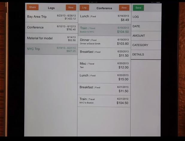
Here's an example of a simple HTML5 app that I built to illustrate some basic responsive techniques. It's an expense tracking application running in a full-screen browser. It makes use of CSS transforms and animations and the responsive changes are initiated through JavaScript.
The main components are: a list of expense logs, a list of the expenses in each log, and the details of each expense. The details each have their own editing widget.
When running on the small portrait screen of a smart phone, the major components slide side to side, indicating hierarchy in a traditional manner. The editing widgets cover the screen, coming up from the bottom.
In a landscape orientation, some of the widgets are sized differently to fit the layout better, and they now come in from the right. The list items are stretched appropriately to fit.
Here is the same code running on a tablet. The list of logs slides in as before. The list of expenses is shown along with the details and the editing widgets have their own dedicated area on the screen. The keypad no longer needs to show the value separately from the expense details. The direct manipulation of the widgets is more obvious and canceling is only done for the whole expense, not an individual entry.
In tablet landscape, the list of logs can be displayed along with the expenses in each, so there is no longer a need for sliding around.
Just to emphasize how this is a single HTML5 codebase, here's the same URL running in Android on a Nexus 7 instead of iOS like I've been showing so far.
This example shows some simple thinking about having the layout of an app respond to different types of devices and orientations. It mainly tried to make best use of the screen real estate.
Being responsive, though, can be more than just responding to screen height and width. You may also want an app to configure itself based upon how the user will be operating it.
For example, you might want a configuration more tuned to a person walking and entering data, in which case you may need much bigger touch areas than that normally needed when stationary. Or, like in this handwriting capture application that I wrote a few years ago for the iPad, have an alternative configuration for left-handed people who write with their fingers above a writing instrument. A user-controlled setting switches the configuration.
Of course, there is obviously the need to have configurations for people with less visual acuity than you normally expect, or no vision, or with vision but not looking at the screen during operation.
Here are some of the types of patterns I think would be helpful to share among developers.
- When does a top-to-bottom flow work vs. side-to-side?
- What should be hidden?
- How should particular tool palettes be displayed? As overlays or pushed in or as popups? Should they be partial or full screen?
- What types of controls work well for which type of input on which size screens and in which situations?
- What should you change between portrait and landscape orientations?
- Which situations should we be responsive to?
- What about mouse, pen, or hover capability?
- What do we do about context sensitive help information?


Comment