
When building a mobile application, a very important consideration is layout including graphics and typography. It is natural to be concerned if certain fonts will be readable on a 4x2 screen or if a 900 pixel image will fit porperly on an 1080 x 2340 pixel screen of an iPhone 13 mini.
These matters cannot be resolved without understanding the differences between screen resolution and screen size. Although very much related, they are quite different.
With the help of this guide, you will better understand the differences and how to organize your content in ways that are both logical and aesthetically sound.
Lets get started.
#1 Why Screen Resolution and Screen Size Are Different (and Why It Matters for UX)
When examining the specifications of any model of smartphone, you notice statistics for both the screen size and screen resolution.
#2 Understanding Pixels vs. Physical Inches in UI Design

Pixels
Pixel, short for picture element, is the smallest individual element that makes up a display. It’s the single color dot from which you can create a larger image.
The number of pixels in an image is what determines the resolution.
For example, if you have a 10×10 pixel image, it means that the grid is 10 pixels wide and 10 pixels high, meaning you have a total of 100 pixels.

#3 Mobile Design Glossary: Points (pt), DPI, and DP Explained
Let’s take a quick look at some common terminology you’ll find when referring to screen size and resolution.
Points
Points aren’t the same thing as pixels. This is a unit of length, most often used to measure the height of a font.
1 point equates to 1/72th of an inch.
How many pixels equal a single point depends on the resolution of the given image. If you have an image that’s 72ppi (pixels per inch), then one pixel will equal one point.
DPI
DPI is short for dots per inch and is also sometimes referred to as PPI, which is pixels per inch. DPI calculates the number of pixels in an inch of screen.
DP
DP stands for density independent pixel. It’s a unit nearly identical to points and is used by Android.
One dp is equal to roughly one pixel on a medium-density screen (160dpi). This is the baseline density, and Android will translate this value to the correct number of actual pixels for other densities.
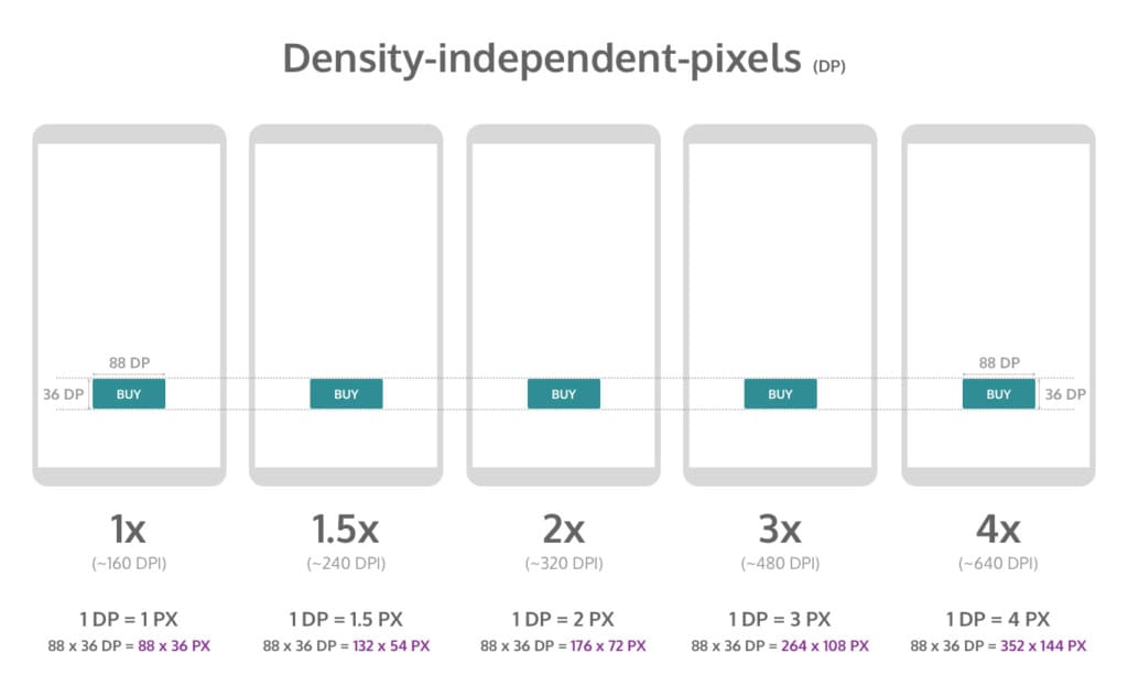
You would use dp when designing Android layouts and points for when designing iOS layouts.
Here is how you can convert points and pixels:
iOS Pixels = (Points x DPI) / 163
Android Pixels = (DP x DPI) / 160
#4 How to Calculate PPI (Pixels Per Inch) for Any Device
To know what the PPI of a device is, you’ll first need to know the size of the screen and the screen resolution.
You’ll need to square both numbers of the resolution and then add them together.
Then you’ll need to get the square root of that number and divide it by the size of the screen.
Let’s look at the same example of the iPhone 12 we mentioned earlier, which has a resolution of 2,532 x 1,170 and a screen size of 6.1 inches.
1. Square both resolution numbers and add them together:
(2532 x 2532) + (1170 x 1170) = 7779924
2. Get the square root of 7779924 = 2789.25
3. Divide that new number (2789.25) by the screen size (6.1 Inches) = 457 PPI.
According to Apple, the PPI they have listed for the iPhone 12 is rounded up to 460 PPI.
PPI is important because it tells you how well that image will be displayed on a specific device.
Build Screen-Agnostic Apps Faster
Why spend hours manual-coding for every screen density when you can use a platform designed to handle the heavy lifting? Learn how Alpha Software helps you deploy responsive apps without the layout headaches.
Book a Demo of Alpha Anywhere#5 How to Design Responsive Android Layouts for Multiple Densities
Just like with iOS, Android also runs on several different devices, each of which have varying screen sizes and even pixel densities.
When you develop an app, you need to make sure the system will scale and resize to adapt its UI interface to these different screens.

If you’re developing for Android applications, be sure to check out their thorough documentation on how to adapt your app accordingly.
Let’s run through some basics for developing an app for Android screen compatibility.
3.1 Screen Sizes
The screen size takes into account things like the screen orientation, screen UI elements, like a navigation bar, and changes to the window configuration, like multi-window mode.
By default, your app’s layout will be resized by Android to fit the screen it’s being viewed on.
To ensure it resizes well, app developers will need to implement a flexible app layout.
For example, rather than hard-coding the size and positioning of UI elements, it’s better to allow view sizes to stretch. Specify their positions relative to the parent or sibling views so the intended sizes remain the same even as the layout changes.

While flexibility is important, so too is having alternative layout designs to optimize the user experience.
Android allows you to use alternative layout design files that the platform will use at runtime based on the screen size of the device being used.
PRO TIP:
Since your layout should stretch to accommodate the current screen size, your images should also be able to stretch without getting skewed.
Android solves this by using nine-patch bitmaps where you can specify the small pixel regions that can stretch, leaving the remainder of the image unscaled.
3.2 Pixel Density
Pixel density is essentially the DPI, which if you remember from our previous section, is the number of pixels in a physical area of the screen.
The goal when developing your app is that it has density independence, which is when it has the ability to maintain the physical size of the UI design when shown on screens with varying pixel densities.
This is important because without it, UI components, like a button, for example, might look too big on a low-density screen or too small on a high-density screen.
It’s also crucial to ensure your images look their best on all screens by providing alternative bitmaps to match various screen densities.
For instance, if you only have bitmaps for medium density screens, it might not look good when Android automatically scales them up on high-density screens.

In some cases, you can avoid having to create separate images for each density by using vector graphics.
Since vector graphics uses geometric line paths rather than pixels, they can be drawn at any size without scaling issues.
3.3 Screen Incompatibility
Android offers all of the tools and documentation you need to ensure your app is configured and available for all screen sizes.
However, you can declare your mobile application supports only specific screens if you don’t want it available on certain screen configurations due to incompatibility.

Android allows you to limit how much it can resize your app and even restrict which devices can install that app.
You can declare a maximum aspect ratio, a maximum screen size, and restrict your app for specific sizes and densities, if you’d like.
With that said, Android recommends you design your app so it can adapt to all screen sizes and densities.
#6 iOS Screen & Image Resolution: Designing for @2x and @3x Displays
iOS has similar guidelines for the visual design and layout of mobile apps, but it’s a bit more strict and less forgiving.
6.1 Screen Sizes and Orientations
iOS has many screen sizes which can be used in portrait or landscape orientation.
All devices have a rectangular, edge-to-edge display.
If you visit the iOS documentation page, you can see every device as well as the corresponding dimensions.

6.2 Image Size and Resolution
iOS uses a coordinate system based on measurements in points, which translate to pixels in the display.
A standard, baseline resolution has 1:1 pixel density, with 1 pixel equating to 1 point. Since higher resolution displays have higher pixel density, they demand images with a greater number of pixels.
If you have a standard resolution image that’s 100px x 100px, for example, the @2x version would scale it up to 200px x 200px, and @3x would scale it up to 300px x 300px.
PRO TIP:
Provide high-res images for all devices your app will support. You can do this by multiplying the number of pixels in each image by a specific scale factor (e.g. @2x, @3x).
6.3 Design High-Resolution Artwork
Here are some tips on designing high-res art for iOS mobile apps:
- Your images will look best on iOS devices when using an 8px-by-8px grid. This will keep your lines sharp and ensure the content is crisp on all sizes.
- Use the appropriate format, like de-interlaced PNG files for bitmap/raster artwork, and JPEG for photos, etc.
- Use the 8-bit color palette for PNG graphics, which will help reduce the file size without a loss of quality.
- Optimize JPEG files by finding the right balance between file size and quality.
- Provide alternative text labels for icons and images for accessibility purposes.

6.4 Read the Docs
As you can tell from these past two chapters on iOS and Android guidelines, there’s a ton of details you’ll need to know about and implement when creating an app for multiple devices and screen sizes.
When in doubt, read the docs! Both platforms come with thorough documentation on best practices and specifications for designing an app on multiple devices.
#7 Optimizing Mobile Apps for Every Screen Type
Regardless of what type of mobile device you are designing for, your understanding of screen sizes, screen resolutions and pixel densities will be vitally important.
It will be a good idea for you to familiarize yourself with all of the terminology we've discussed and read related documentation of the platforms you’re developing for to ensure your app will display perfectly for all users.
Ready to simplify your development workflow?
Don't let screen fragmentation slow down your launch. Whether you're targeting iOS, Android, or both, Alpha Software provides the tools to ensure your UI is perfect on every device.
Contact us today to start your next project


Comment