We are all done wmg srcth our app design mockup and have created some web ready reference files to assist in our app build. If you didn't get those files from part 1 of the tutorial, you can simply download them here.
You should also have your Twitter API Key and Secret API Key now. Have that information ready, you will need it shortly.
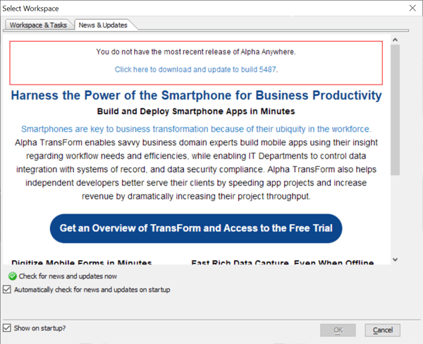
It's time to open the Alpha Anywhere application. When you do you, you might see a popup for News & Updates like the image below.
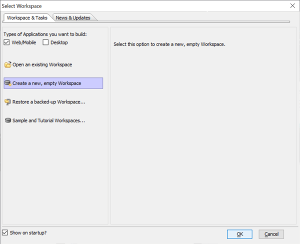
Next, click on the Workspace & Tasks Tab, Then select "Create a new, Empty Workspace" and then click "OK".
Now you might see another popup titled, "Startup Control Panel". If so, click the left check box to choose to "Open the Web Control Panel when this Workspace is opened." Then click "OK"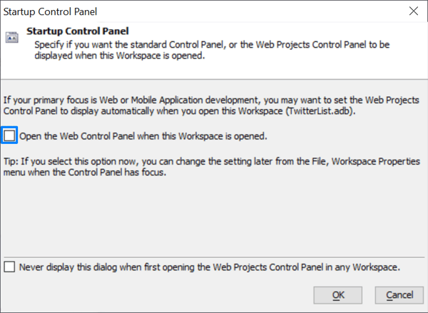
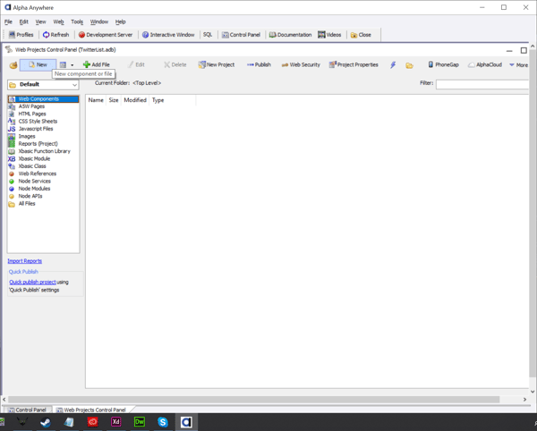
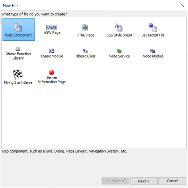
Now that we have an Alpha Anywhere workspace open, you should see a blank Web Projects Control Panel in the foreground. This will be where you build your Twitter List application. To get started make sure that "Web Components" is selected in the left menu and then click the "New" button.
A menu with available File types should appear. At this time you should select "Web Component" and click "Next >".
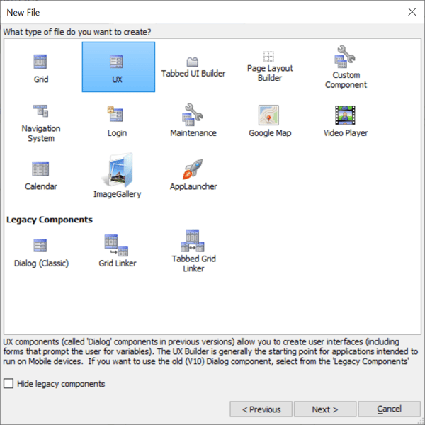
Now you will see a menu of available Web Component types. In this case we want to select "UX" and the click "Next >".
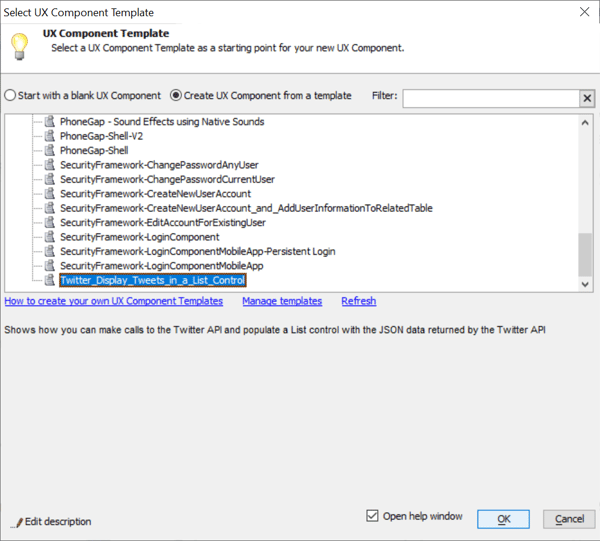
Now Alpha Anywhere is asking if you want to "Start with a blank UX Component" or "Create a UX Component from a template". In this tutorial we are planning to modify a template that displays tweets so we will scroll to the end of the list in this menu and select "Twitter_Display_Tweets_in_a_List_Control" then click "OK"
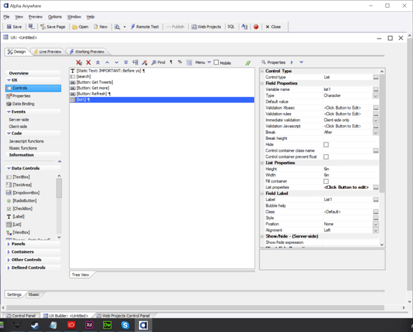
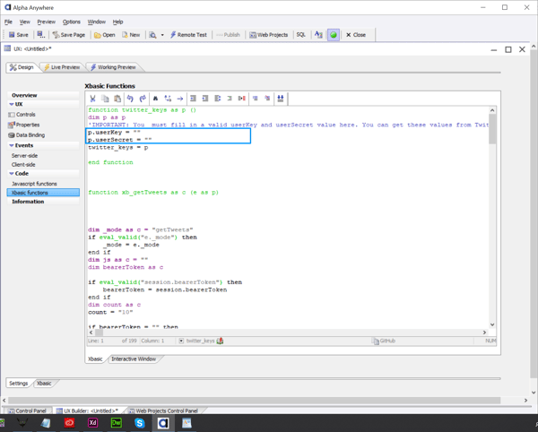
Now you should be taken to your new UX Component screen. You will see a list of controls displayed in the central window. We will modify each of these controls to fit our design but first we need to enter our Twitter API keys.
On the left menu panel you should select "Xbasic functions". At the top of the Xbasic Functions page, you should now fill in the API Key and Secret API Key within the corresponding quotation marks. This provides the connection to the Twitter service so that your app will work.
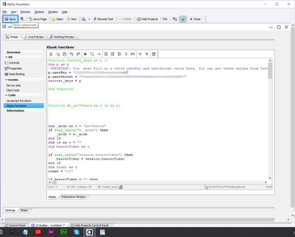
Once you fill in the keys you should save your modified UX Component.
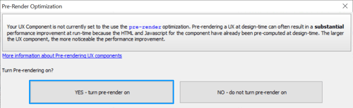
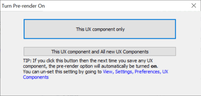
At this point you are likely to see a couple of popups asking if you want to "pre-render" this UX. First select "Yes - turn pre-render on" and then select pre-render for "This UX component only". After that you will be prompted to provide a save name in the default folder. Complete this step and you will be ready to do the first test of the Twitter component.
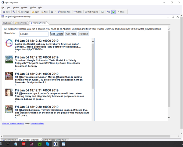
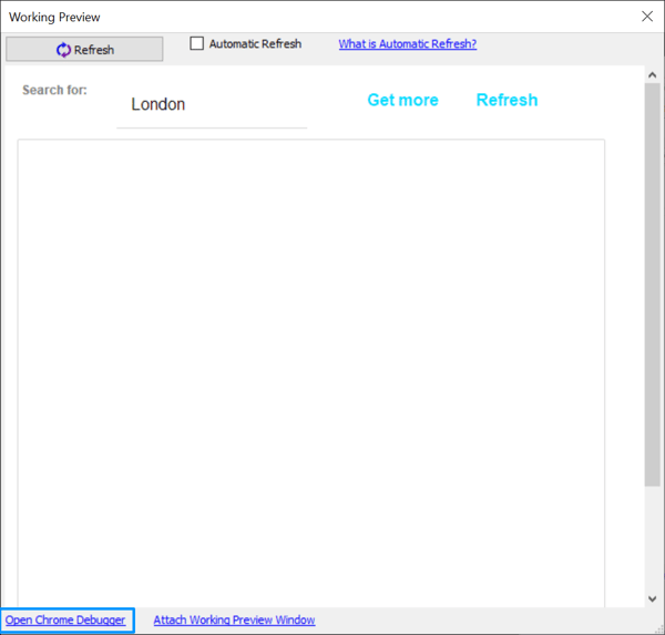
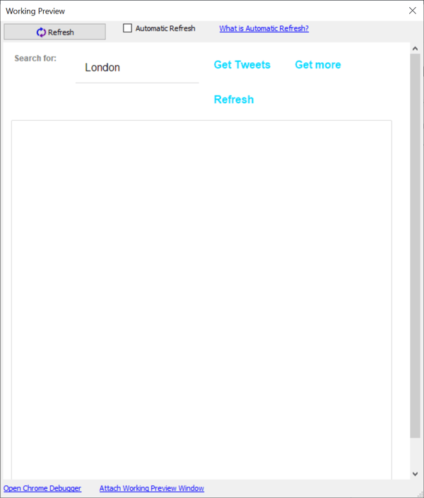
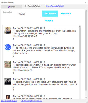
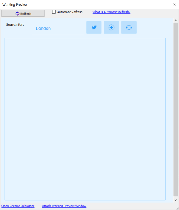
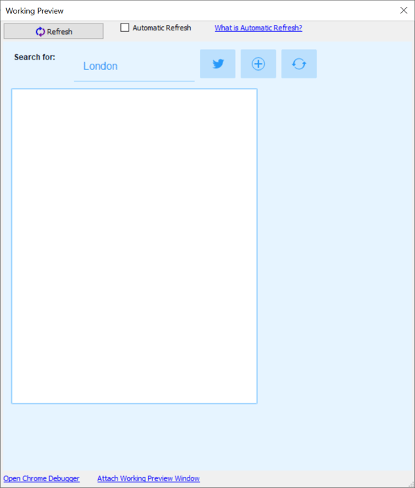
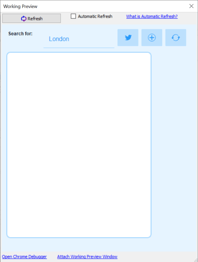
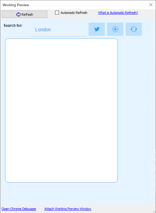
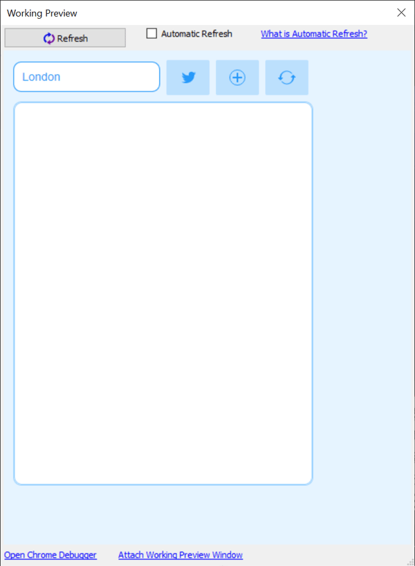
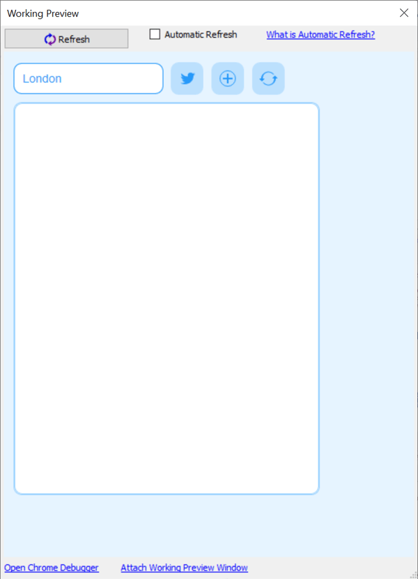
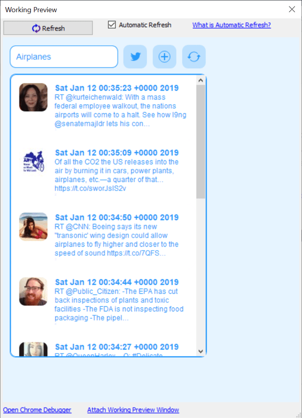
Now that you have saved the component it's time to test it. We will select the "Working Preview" tab at the top of the UX Component window. Right away we should see the stock Twitter List with the term "London" auto filled into the search field. Go ahead and click the "Get Tweets" button. At this point the lower box should populate with all the most current tweets that have some reference to "London".
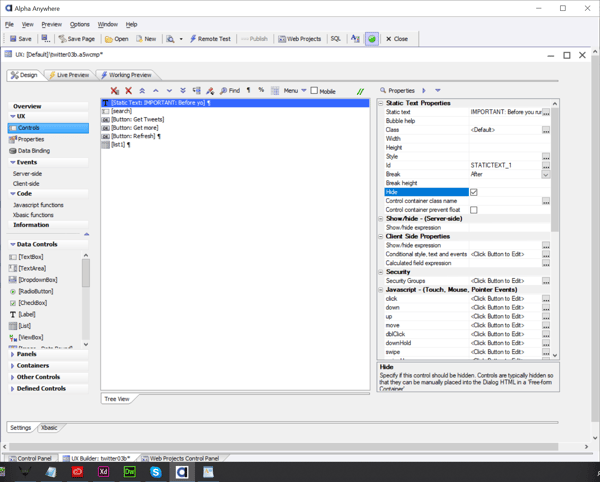
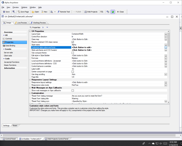
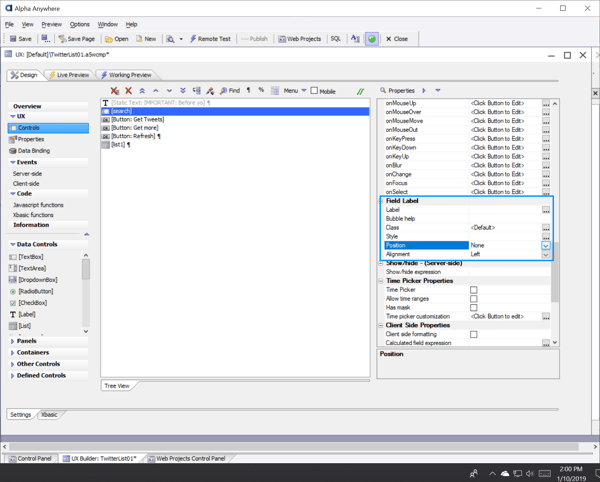
Now you should select the "Design" tab and then select "Controls" in the UX section of the left panel menu. Here we see a number of controls that we must alter to give our app the desired look. Since we've already entered our API keys, the first thing we should do is to hide the "IMPORTANT" text reminder at the top of the component. To do so, select the "[Static Text: IMPORTANT:Before yo] control and then click the checkbox next to "Hide".
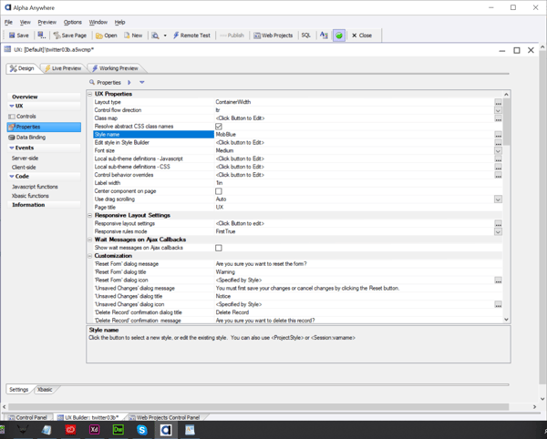
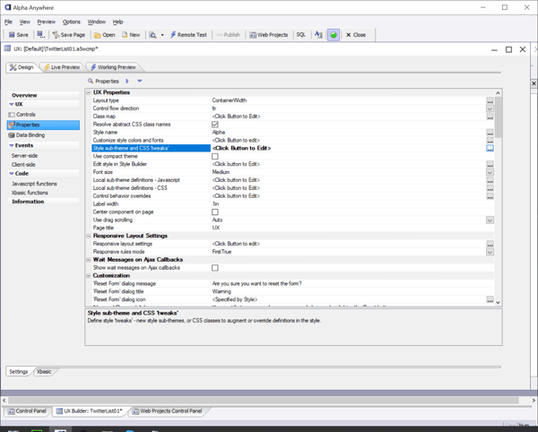
Next we are going to want to begin to edit the style of the component. To do this we will first want to change the components existing style to a more current one that we can tweak. To do this, select Properties in the left menu panel. Five lines down from the top of the page you should see "Style Name" to the right of that is the current style, MobBlue. This is an older style that is no longer actively supported. Let's change that. Go ahead and click the "..." to the right of MobBlue.
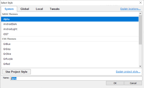
That will bring up the "Select Style" window. Choose Alpha as your new style and click "OK".
Now we want to see the difference. We can do this by clicking on the "Working Preview" tab. 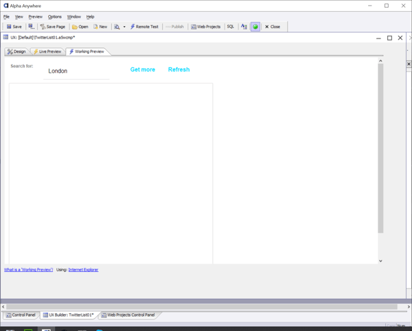
Okay, so it's not really what we had in mind. There are many elements that we will need to "Tweak" before this style is correct. We'll go into all the things we want to change in a moment. Before we do that, we should set up our working environment to get the work done. We will need a way to view our projects current state, find code that defines the elements we wish to change, change the code accordingly, and then see the changes. The best way for us to accomplish those goals is to combine the use of an External Preview and the Chrome Debugger.
We've done a great job setting things up and getting the core functionality in place. To do the fine tuning of our design in Alpha Anywhere we are going to need to find and edit the code that styles our buttons and list design. Finding just the right code to edit takes a little hunting.
The best tools for identifying the code we want to change are to create an external working preview of the UX component and then to examine it using the Chrome Debugger. When using these two tools in conjunction, we can see the code that displays the application and locate the specific class tag names that relate to the elements we wish to alter. The we can go back into Alpha Anywhere to write new code that will change the style accordingly. If this sounds complicated, not to worry. I'll walk you through it.
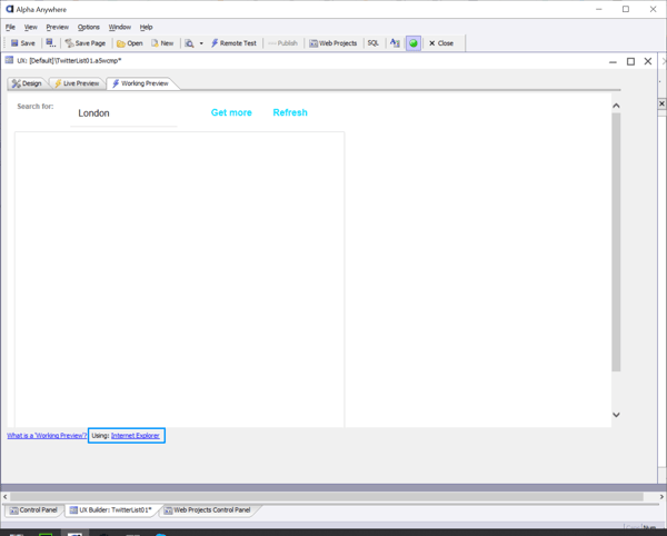
First click on the "Working Preview" Tab and then click the "Using: Internet Exporer" link at the bottom of the tab.
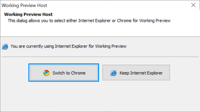
Doing so will bring up a panel asking if which browser you wish to use to preview. At this point you should select "Switch to Chrome".
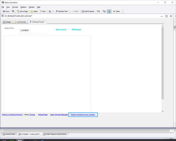
Now you will be back in your Design tab. Click on the "Working Preview" tab again. This time you have more options available to you at the bottom of the tab. Click the link in the lower right titled, "Detach Working Preview Window".
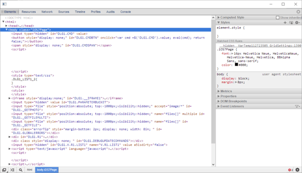
Now you have a separate window for previewing your work. Look to the bottom of this new preview and click "Open Chrome Debugger".
And Voila! The Chrome Debugger appears. This handy tool will help us find all the class names of elements we will to restyle.
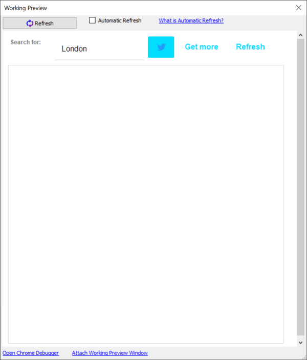
Okay. Now that we have all the necessary tools at our disposal, lets look at our original design mock up and compare it to our detached working preview.
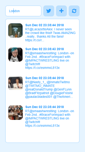
The mock up has a list box that is populated with tweets. Our design doesn't have that till it has been activated. To do so, click we need to click the Get Tweets button. Click the "Get Tweaks" button to get tweets for our list.
Now we can compare our mock up and the working preview that is populated with Tweets.
From the two images above, we can see that we need to change a number of elements to get this right. Let's make a quick list of the tasks we want to accomplish to make the UX component (right) look like the mock up (left).
Now at this point, there are a couple of different ways to change the style of the component. One way is to make a copy of the style we are using (Alpha) and then change that style. In this tutorial, we will instead use the "Tweaks" method. By using Tweaks, we can leave the existing style unchanged on our system but then overlay/overrule chosen design elements with new style code.
The first task on our list was to change the text based buttons into rounded blue buttons with icons. We can take this first step and do it in a way that tells Alpha Anywhere that we are going to use Tweaks by doing the following steps:
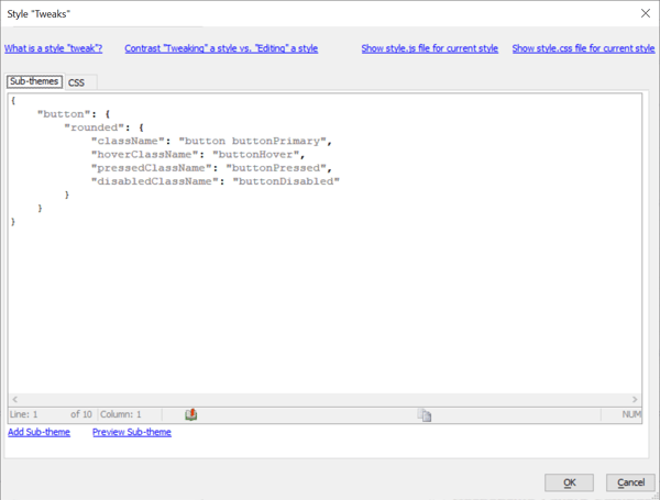
1. In the "Design" tab, select properties on the left hand panel then click the "..." button to the right of "Style sub-theme and CSS "tweaks".
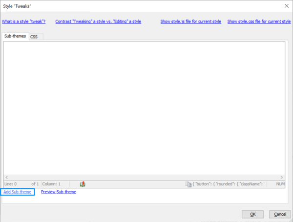
2. Then we want to click the Add Sub-theme link at the bottom of the Style "Tweaks" panel.
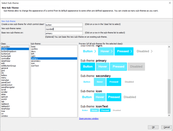
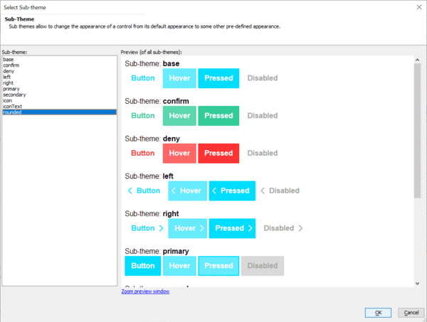
We know we want to make a Tweak of the button class so let's choose "button" in the "class" menu on the left, select "primary" from the Sub-theme menu, and then type "rounded" in the "New sub-theme name:" field. Then click OK at the bottom of the Select Sub-theme panel.
Now we have returned to the Style "Tweaks" panel but now we see that Alpha Anywhere has generated some code that defines the Tweak for our new rounded button style. By doing this, Alpha now knows that we will be using "Tweaks" as our form of style modification. We can return to this panel at anytime to create more sub-themes as needed. When ready to move on, click "OK" at bottom of the Style "Tweaks" panel.
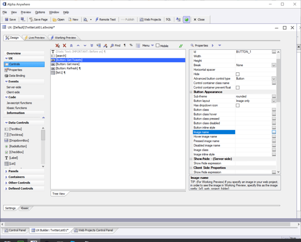
Now let's take some more steps to bring that rounded button style inline with our design goals. First we should go back to the "Design" tab and select Controls in the left panel menu. Then select [Button: Get Tweets] from the list of controls in the middle window. Then in the properties list to the left, under Button Appearance, you should click "..." to open Sub-theme.
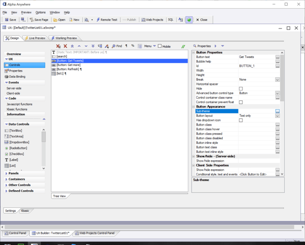
Then select "rounded" and click "OK".
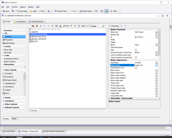
Now we want change the Button layout from "Text only" to "Image only"
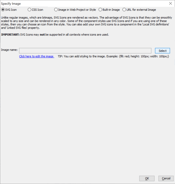
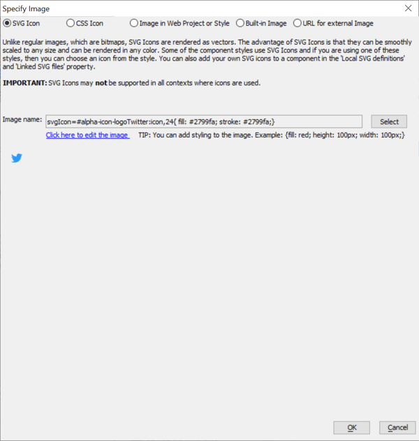
Then click "..." for Image name which opens the specify image panel.
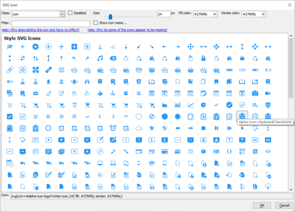
There we should choose SVG Icon at the top then click select on the right.
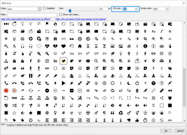
That brings up the icon list. Here we want to find and select the alpha-icon-logoTwitter image. Now we want to define it's color so click "^" on Fill color at top of the icon panel.
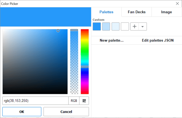
That should bring up the color picker. Normally you would have looked up the color from your mock up. For expediency, I'll tell you the color of the logo. Enter rgb(38,153,250) for the color value and for future use, click the "+" button to make this a custom palette color. Then click OK. While we are at it we can build swatches for all the custom colors into this palette. We recorded those colors in the previous section. The other colors were light blue (188, 224, 253) , lighter blue (230, 244, 255) , and white (255, 255, 255) .
Now you will see that the color of the icons has changed but some of them have a black outline. Lets also change the stroke color value to rgb(38,153,250) to make the icons just blue. Now click OK.
Now we see that the SVG image name contains the definitions needed to properly display our Twitter icon. Let click OK.
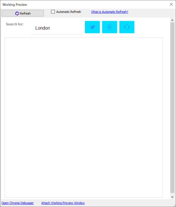
Now lets go back to the "Working Preview " tab. This should update our external preview window and now we should see something like the image below. It's not perfect but it's getting closer.
That was a good start. Let's do this same process for the other two buttons. Just repeat the previous steps by selecting [Button: Get More] from the controls list. Then repeating the previous steps to make the necessary modifications in the Button Appearance section. Start again with Selecting the "rounded" Sub-theme, choose Image only for the Button layout, and this time choose the icon called "alpha-icon-addCirlceBorder" and enter #2799fa for the fill and stroke color. When done repeat the process one more time for the last button using the icon called "alpha-icon-refresh". After that you can return to the working preview and you should see something like the image below.
Now we have 3 buttons that are closer to our intended design but not quite right. Going back the notes from our HTML mock up I know that I want the button background color to be rgb(188, 224, 253). I also want to buttons to have a rounded corner radius of 10.
The easiest way to start this process would be to do our best to generally apply the proper colors to the whole application using the Customize Style Colors and Fonts function in the apps Properties.
Now we have a menu of different color options for our design. You can assign values for backgrounds, foregrounds, accents, etc.. experiment with the different color choices. Not all color categories will have an effect on this particular design.
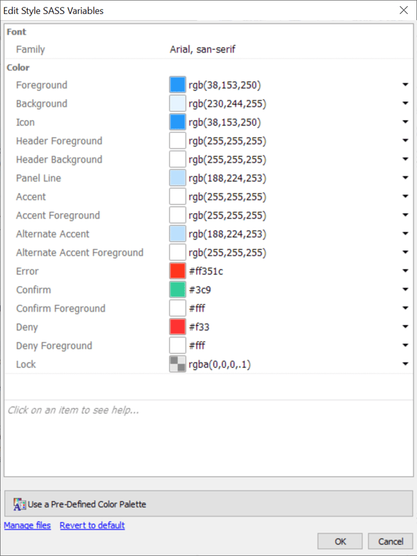 After you are done experimenting with your color options, set the colors as I've done in the picture above. Foreground and Icon are bold blue (38, 153, 250) for the icons and text. The background is the lightest blue (230, 244, 255). The outlines and buttons backgrounds are changed via the Panel Line and Alternate Accent color to Lt Blue (188, 244, 253). We will leave most other options to white for now. If you made swatches for your custom palette earlier in this tutorial, this process was quick and easy.
Now lets take a look in our working preview. It looks a lot better. We still need to adjust corner radius and we now need to find a way to make the list area have a white background. We also need the search to have a rounded white entry field with lt blue outline.
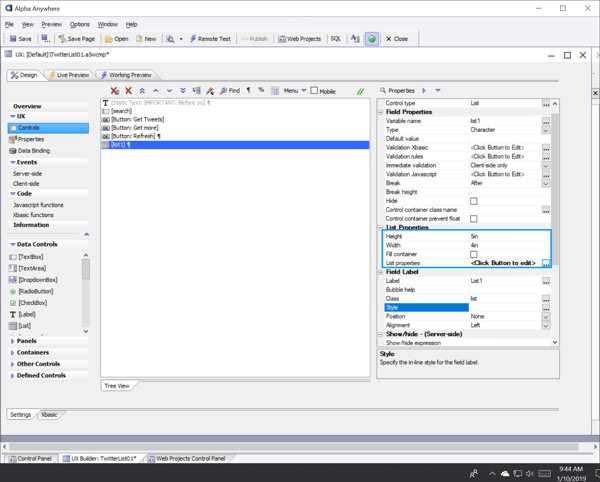
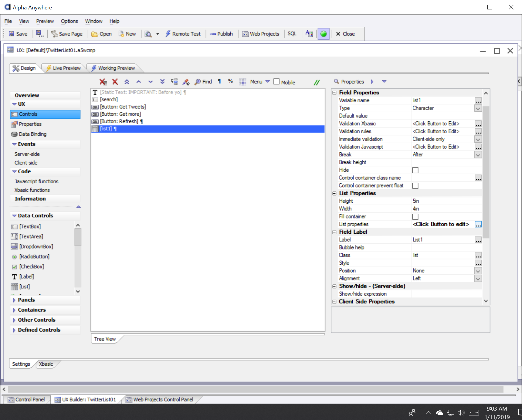
Lets edit the List area that will display our Tweets. Right now it's too wide, too blue, and not rounded. In the left side UX menu, select Controls and then choose [List] from the controls in the central display. Now change the Height to 5in and the Width to 4in. Then click "..." for List Properties to open up the List Builder.
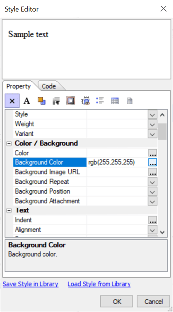
The List Builder gives you total control of your list style and function. We just want to make a simple adjustment to the color. Click on the List Properties tab and then click "..." for "in-line style".
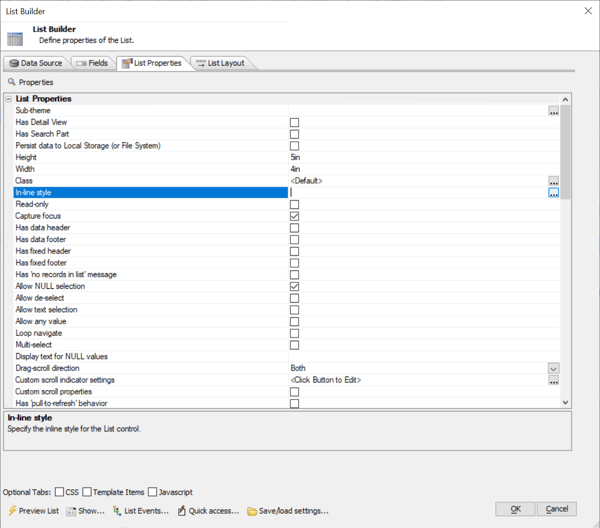
Now you will see the Style Editor. Here we can just change the Background Color to White or "rgb(255, 255, 255)" and then click OK.
Click OK in the List Builder so that you are back at the UX Control panel, click to save and then check out our progress with the working preview.
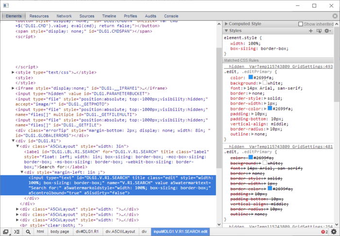
Unfortunately the option for rounded corners is not in the List Builder. We will have to put that code in manually. This is where that Chrome Debugger will come in handy. To use this tool properly, we should set up our Chrome Debugger side by side with our working preview like I have done below.
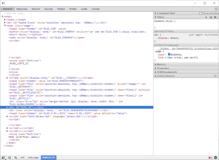

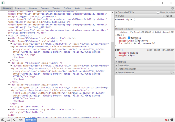
The Chrome debugger is now showing the code that Alpha Anywhere has created to display the working preview. Most of the information you seek is hidden in lines of code that need to be expanded. To find where you need to focus, try hovering your mouse pointer over the different lines of code. You should information and highlighting flicker around on the Working Preview. This shows you what lines of code are related to each part of the display.
When you hover over <div id="DLG1.R1">...</div> you will notice the whole UX control light up. This means that the code for displaying the app is all under this parent line of code. We want to expand out the other lines of code using the little triangle on the left side of that line of code. You will see more lines of code with more triangles. Hover over those till you see one that causes the list box to light up again. Expand that line and keep doing the process till you've expanded all lines of code related to the list. Your debugger should look like this now.
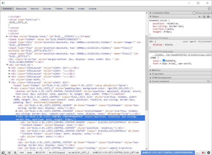
Now when we click on the different lines, different variables such up under the "Styles" panel in the upper right. You can actually edit code in that panel. While these edits are not permanent alterations, it allows you to see various effects applied to your design. Notice the two lines of code highlighted in the image below. I have written in the line of code, "border-radius: 10px;" on those two lines. Make those changes yourself and you will see that there are two layers in this display that both need to be changed to get the box to appear rounded.
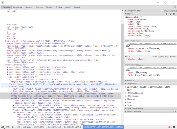
This had applied the effect to our design that we are looking for. Unfortunately, the effect is only temporary since the hasn't actually been altered in Alpha Anywhere yet. We can use the code shown in the debugger to make note of the "div class" names on those two lines so we can alter the correlating code in Alpha Anywhere next. Disregard DLG1 parts of names since that is just an xbasic marker. You will note that also shown in the class name of the gray highlighted area it mentions List1 (the name of our list) then a space and then "list" which is the div class name we want to manipulate.
Now we want to go back to the List Builder and again click on the List Properties tab. This time, scroll down to the bottom of the tab till you reach the Advanced section. Click on "..." for Local CSS. In the code tab of the CSS Editor, as shown in the image below, type or paste in the following code:
.list {
border-radius: 10px;
}
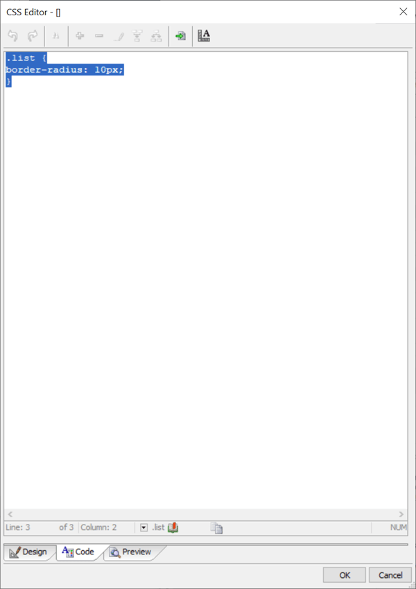
Then Click OK to close out the CSS Editor and List Builder. Then Save and click Working Preview and Presto Chango! The list container is now rounded.
Make the Search Field Look Right
Now we will also want to make the search field fit our design as well. We will use the same Preview/Debugger method because it will help us to identify the class name for the search field. In the image, I've highlighted the code that was associated with the search field. In that line of code you can see that the class is "edit".
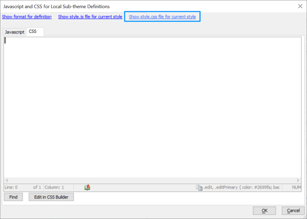
Now we go back to Alpha Anywhere. In Properties, we click "..." to open "Local sub-theme definitions - CSS"
Now you should have just opened an empty page of Javascript and CSS Local Sub-theme Definitions. You want to select the CSS tab and then click "Show style.css file for current style"
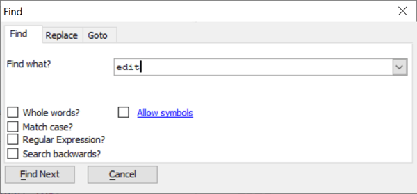
You will now see all the CSS style code. Click "Find" to bring up the Find tool shown below. Then enter edit into the field and click the "Find" button to jump to the appropriate lines of code.
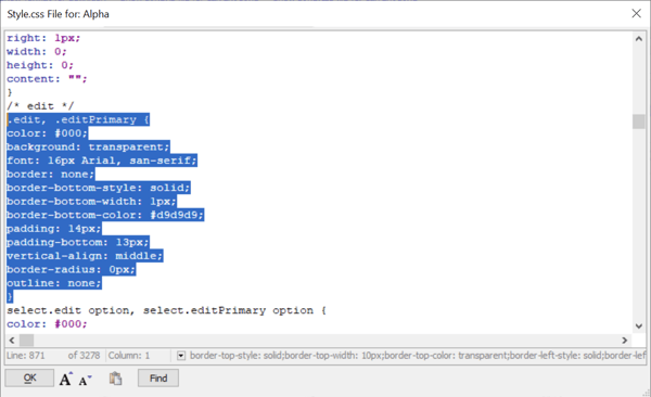
You reached the right spot when you see the line, "/* edit */". Highlight the code just below as I have done. Hit Ctrl-C to copy that code. Then click OK.
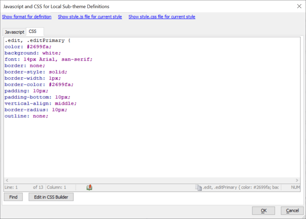
Now you will be back in the empty CSS Tab. Paste the code here and change the following lines.
We should also eliminate the label for the search field. To do that select Controls in the left side UX menu. Select [search] in the center panel, and the scroll down in the right panel till you see a section for Field Label. Click the "..." next to "Label " and then erase the "search for:" text and then click OK. Then a few lines below you should select the option of "none" for position.
While we are here, lets make the search field a little smaller. If you scroll back up to the top of the right panel all the way till you reach Field Properties, you will see an option for Width. Change the width value from 3in to 2in
Now we can save again and check our working preview. Not bad! We are making some serious progress here.
Lets take a quick look back at our list of tasks. We are almost done with most of our remaining work in the last two items regarding the formatting of the Tweet lists. Yet, the first item that we attended to on the list, styling the buttons, is still not quite right. The buttons seem a bit too large and the button boxes are too square. Let's go back to those buttons now, using our Preview/Debugger method to find the class that needs to be modified to perfect the button style.
When we expand the code under the parent div "DLG1.R1" and the subfolders for the three buttons held within. There you can see that all three of them have a class name "button buttonPrimary" Let's go take a look at the style.css code again. This time we will try to find code for .button
To do this we want to go back to Properties in the left UX menu. Open Local sub-theme definitions - CSS to bring up our previous CSS edits. Once again we want to click the "show style.css file for current style" link in the upper right.
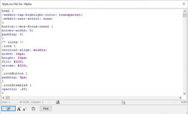
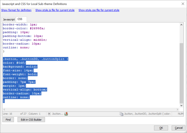
Now click the Find button and then enter ".button" into the "Find What?" field. Now you should see a bunch of style variables that define our button under the line /* buttons */. Grab the following 13 lines of code:
.button, .buttonDD, .buttonSplit {color: #0df;background: transparent;font-size: 16px;font-weight: bold;border: none;padding: 9px 14px;margin: 0px;vertical-align: middle;line-height: 26px;border-radius: 2px;outline: none;}
paste that code into the CSS panel you are now in and adjust the code as I did below;
.button, .buttonDD, .buttonSplit {color: #0df;background: solid;font-size: 14px;font-weight: bold;border: none;padding: 7px 7px;margin: 1px;vertical-align: bottom;border-radius: 10px;outline: none;}
I was able to get the results I wanted by modifying the background, padding, margin, vertical-align, and border-radius. Here you can see the code in Alpha Anywhere.
And here are the results from the Working Preview. Looks better!
We will go back and tighten up the list panel width to match our buttons now. Go back to UX/Controls/[List1] In the right panel under List Properties we had previously set the Width to 4in. Let's change Width to 3.57in. Then Save and view the Working Preview once more.
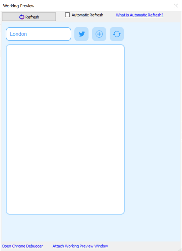
Looks pretty spot on to me. Let's focus on formatting those Tweets now.
Now we are almost done with our list of tasks. The last two items on the list were:
Let's focus on the first item. For me the text is already blue because we set the global foreground color to the bold blue color in a previous step. Instead let's make the text a little smaller and make the headers be bold.
Can you guess how we are going to find the class names for us to edit?
Yes, you guess it! We will use the Preview/Debugger method.
This time we will be sure to click the Twitter Icon button on our Working Preview to load the Tweets. We can then hover over the code in the debugger to find the class names.
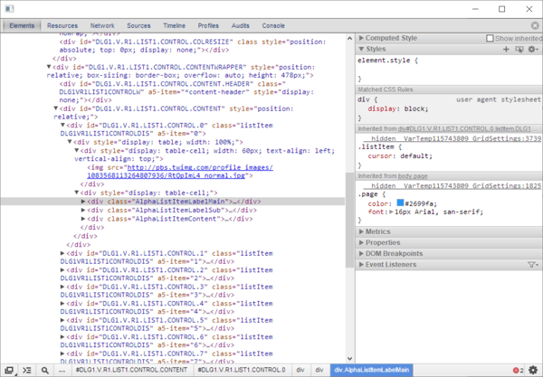
As before, expand DLG1.R1 and this time also expand the A5CWLayout code for List1. Keep expanding code till you see the div class names AlphaListItemLabelMain, AlphaListItemLabelSub, and AlphaListItemLabelContent. These names are relevant.
When we are back in Alpha Anywhere's local sub-theme definitions - CSS panel. We will open the link to the style.css once more and then search for .list and .listItem to find code to change.
You will see lines of code for .list and. listItem but you can also poke around a bit to see class names for many variables. You can copy any of them from the style.css and then paste them into the CSS Sub-theme definitions panel. By Copy and Pasting in this manner I have isolated the following code segments and made changes them. I've also made some simple font size and weight definitions for the class names that we just found with the debugger.
Below you will find all of the CSS edits we've made from the beginning of this tutorial. You can copy this and paste it directly into your CSS folder if you want.
.edit, .editPrimary {color: #2699fa;background: white;font: 14px Arial, san-serif;border: none;border-style: solid;border-width: 1px;border-color: #2699fa;padding: 10px;padding-bottom: 10px;vertical-align: middle;border-radius: 10px;outline: none;}.button, .buttonDD, .buttonSplit {color: #0df;background: solid;font-size: 14px;font-weight: bold;border: none;padding: 7px 7px;margin: 1px;vertical-align: bottom;border-radius: 10px;outline: none;}.buttonPressed, .buttonPrimary {color: #0df;background: solid;font-size: 14px;font-weight: bold;border: none;padding: 7px 7px;margin: 1px;vertical-align: bottom;border-radius: 10px;outline: none;}.list {border: 1px solid #2699fa;border-radius: 10px;}.listItem {background: #fff;padding: 14px;cursor: default;border-radius: 15px;}.listItemHover {color: #2399fa;background: rgba(230, 244, 255, .75);}.listItemSelected {color: #2399fa;background: rgba(188, 224, 253, .75);}.AlphaListItemLabelMain {font-size: 14px;font-weight: bold;}.AlphaListItemLabelSub {font-size: 12px;font-weight: normal;}.AlphaListItemContent {font-size: 6px;font-weight: normal;color: rgba(35, 153, 250, .25);}
The last thing we want to accomplish is to put rounded corners on the thumbnail images from the list. This is quite easy. We go to UX/Controls/[List1] then click "..." to open List Properties. Now this time you should select the List Layout tab. You see here the code that defines the list that is displayed when you activate the Twitter list. The third line of the code calls the thumbnail image. You can simply add in the inline style code for border radius shown in purple below.
Check it out!
Alpha Software helps organizations build operational applications for data collection, workflow automation, reporting, inspections, compliance, and AI-assisted operations.
Mobile ready. Always.
Available on iOS and Android for connected and offline operation.

© 2026 Alpha Software Corporation. All rights reserved.
